Widget Configuration Guide
Configure and customize your chat widget to match your website
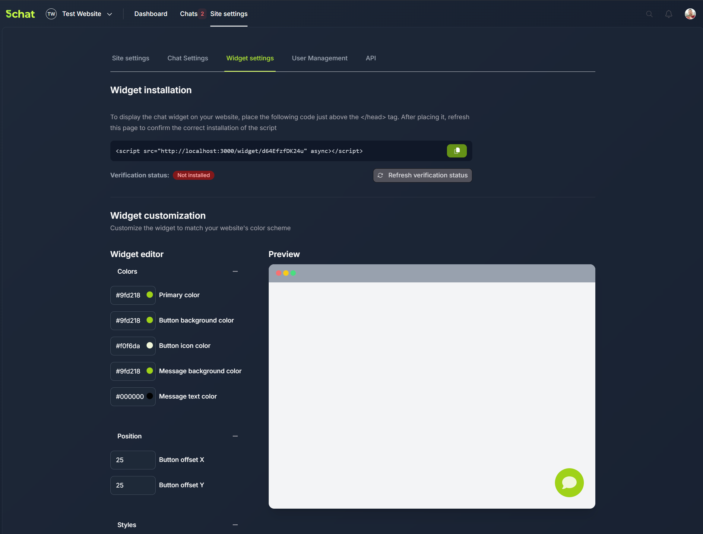
Once your widget is installed, you can customize its appearance and behavior through your dashboard's Widget Settings.
Table of Contents
Customization Options
The widget configuration is organized into three main categories in your dashboard.
Colors & Appearance
Control the visual styling of your chat widget to match your brand identity.
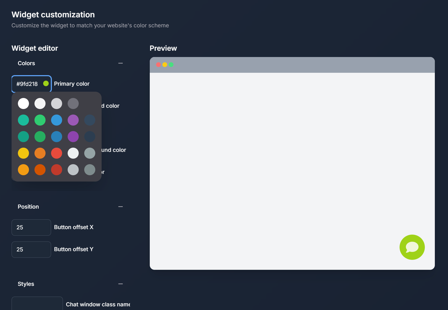
Available Color Settings:
- Widget Color - Main accent color throughout the interface
- Button Background Color - Chat toggle button background
- Button Text Color - Text color for the toggle button
- Chat Bubble Color - Background color for chat messages
- Chat Bubble Text Color - Text color within chat bubbles
Color Tips
Ensure sufficient contrast between text and background colors for accessibility. Test colors in both light and dark modes if your website supports both.
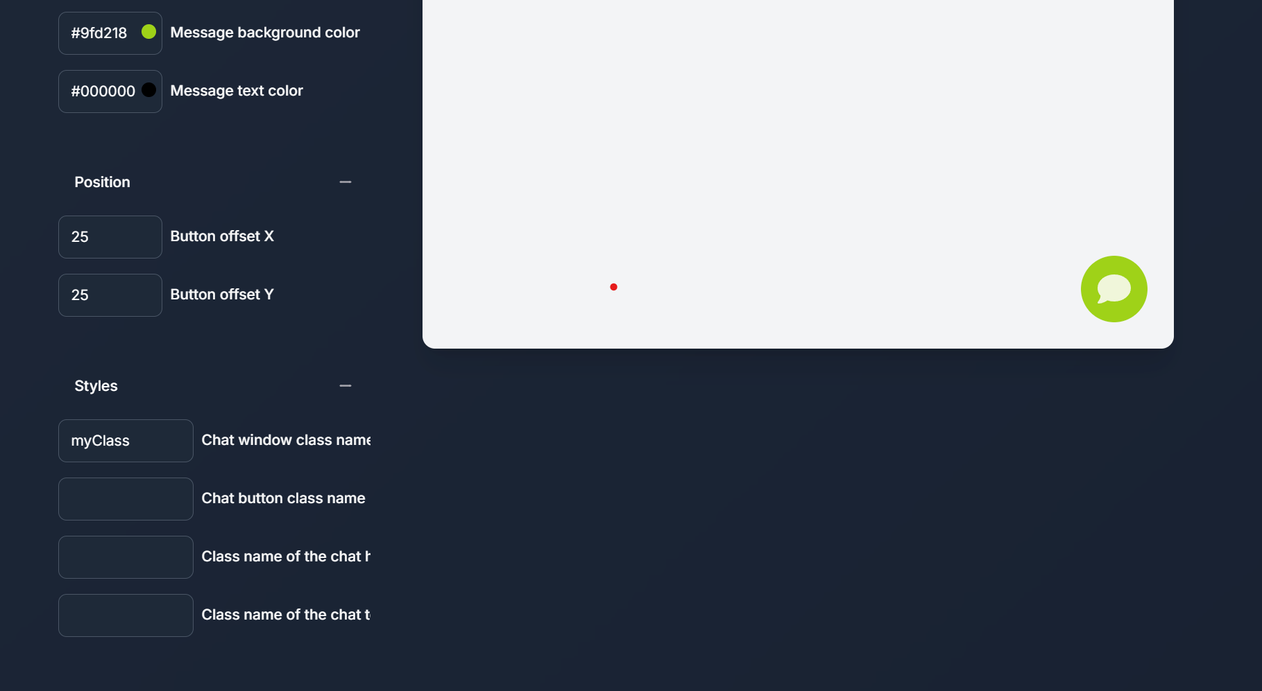
Positioning Controls
Fine-tune where the chat widget appears on your website with pixel-level positioning.
Advanced Styling
For developers who want complete control over widget appearance using custom CSS classes.
Available CSS Class Fields:
- Chat Container Class - Applied to the main chat window
- Button Class - Applied to the chat toggle button
- Chat Title Class - Applied to the chat window header
- Chat Input Class - Applied to the message input field
/* Example: Custom button styling */
.my-custom-button {
border-radius: 50%;
box-shadow: 0 4px 12px rgba(0,0,0,0.15);
}

/_ Example: Custom chat container _/
.my-custom-chat {
border-radius: 12px;
font-family: 'Your Brand Font', sans-serif;
}
Configuration Workflow
Follow these steps to efficiently configure your widget:
- Start with colors - Set your primary brand colors first
- Adjust positioning - Fine-tune the widget placement on your site
- Test responsiveness - Verify the widget works well on different screen sizes
- Apply custom styles - Add any custom CSS for advanced styling needs